
React Dynamic Tree View: Dynamic tree views are user interface components commonly used to display hierarchical data in a tree structure, where nodes can have parent-child relationships. Each node can be expanded or collapsed to reveal or hide its child nodes, respectively.
These tree structures are particularly useful when representing data with parent-child relationships, such as file systems, organizational charts, nested categories, or any data with nested levels.
This is also called the Hierarchy tree view, Nexted Tree view and parent-child tree view.
Key Features of Tree Views:
- Display data in a tree structure with parent-child relationships.
- Nodes can be expanded to show child nodes or collapsed to hide them.
- Users can interactively expand and collapse nodes by clicking on them.
Usage of Tree Views:
Dynamic tree views are commonly used in various scenarios:
- Displaying files and folders in a file system.
- Representing company hierarchies and reporting structures.
- Displaying product categories and subcategories.
- Creating visualizations of interconnected ideas or concepts.
- Displaying the structure of a document or article.
- Navigating through complex datasets with hierarchical relationships
Steps to Create Tree Views Component in React
Creating a dynamic tree view in React involves the following key concepts to produce a visually appealing component for displaying hierarchical data.
Depending on your project’s complexity, you can start with a basic implementation and expand it to include advanced features as needed.
Key Concepts of Tree View
- Create components for nodes, each rendering its own content and managing its state.
- Maintain the expand/collapse state for each node using the React state.
- Pass data and functions down the component tree to enable interactions.
- Design data structures that mirror the hierarchy of the tree.
- Use components that render themselves to handle nested nodes.
- Capture user clicks on nodes to trigger state changes.
- Use conditionals to determine when to render child nodes.
- Apply styles to nodes for improved visualization
1. Set Up Basic Configuration
First of all, You must set up the following basic configuration –
2. Create Calculator Directory
After creating the React App, You will get the default directory structure. Now, Create a calculator directory like –
myapp
 |__src/
    |__ components/
    |    |__tree-view/
    |    |    |__data/
    |         |   |__treeData.js
    |         |__ TreeView.js
    |         |__ TreeView.css
    |__ App.js
    |__ index.js
Default React App contains more folders & files but I have shown here only one
3. Store Tree Views Data
In the src folder of your React project, create a new file named treeData.js (or any suitable name you prefer) inside /src/components/tree-views/data/treeData.js to store your hierarchical data:
This code defines a hierarchical tree structure using nested objects. The structure starts with a root node called “Parent 1,” which has two children: “Child 1” and “Child 2.” “Child 2” itself has a child named “Child 2.1.”
The structure is represented in an array named treeData, which is exported for use in other parts of the application
File Name – treeData.js
const treeData = [
    {
      id: 1,
      name: 'root',
      children: [
        {
          id: 2,
          name: 'item 1',
          children: []
        },
        {
          id: 3,
          name: 'Item 2',
          children: [
            {
              id: 4,
              name: 'Item 2.1',
              children: []
            },
            {
                id: 5,
                name: 'Item 2.2',
                children: []
              }
          ]
        },
        {
            id: 6,
            name: 'item 3',
            children: []
          },
          {
            id: 7,
            name: 'item 4',
            children: [
                {
                    id: 6,
                    name: 'item 4.1',
                    children: []
                  },
            ]
          },
      ]
    }
  ];

  export default treeData;
4. Create a Tree View Component
The provided code defines a React component that displays a collapsible tree structure. It imports tree data, creates a `TreeNode` component for rendering individual nodes, and a `TreeView` component that uses the `TreeNode` to display the entire tree structure. Clicking on nodes toggles their visibility, and icons change to represent folder or document states.
File Name – TreeView.js
import React, { useState } from 'react';
import treeData from './data/treeData';

const TreeNode = ({ node }) => {
    const [isExpanded, setIsExpanded] = useState(false);

    const handleToggle = () => {
      setIsExpanded(!isExpanded);
    };

    return (
      <div className="tree-node">
        <div onClick={handleToggle} className={`node-toggle ${isExpanded ? 'expanded' : ''}`}>
          {isExpanded && node.children.length > 0 ? '?' : '?'} {node.name}
        </div>
        {isExpanded && (
          <ul className="child-nodes">
            {node.children.map(childNode => (
              <li key={childNode.id}>
                <TreeNode node={childNode} />
              </li>
            ))}
          </ul>
        )}
      </div>
    );
  };


const TreeView = () => {
  return (
    <div>
      {treeData.map(rootNode => (
        <TreeNode key={rootNode.id} node={rootNode} />
      ))}
    </div>
  );
};

export default TreeView;
Steps to write code:
- Import the `React` and `useState` modules from ‘react’.
- Import the `treeData` object from the ‘treeData.js’ file.
- Define a functional component `TreeNode` that takes a `node` prop.
- Inside `TreeNode`, set up a state variable `isExpanded` using the `useState` hook, initialized to `false`.
- Declare a function `handleToggle` that toggles the `isExpanded` state.
- Return JSX for the `TreeNode` component, with a div containing node information and an icon that changes based on `isExpanded`.
- If `isExpanded` is `true`, render a list of child nodes with their own `TreeNode` components.
- Define the `TreeView` component.
- In the `TreeView` component, map through each `rootNode` in the `treeData` and render a `TreeNode` component for each, with a unique key.
- Export the `Tree` component as the default export for this module.
5. Design Tree View Component
These CSS styles help create a visually pleasing and interactive dynamic tree view, with clear indicators for the expand/collapse functionality and proper spacing for a hierarchical structure. You can modify these styles as needed to match your design preferences.
File Name – TreeView.css
/* src/styles.css */
.tree-node {
    margin-left: 20px;
    border-left: 1px dashed #aaa;
    padding-left: 8px;
    position: relative;
  }

  .node-toggle {
    cursor: pointer;
    transition: color 0.3s;
  }


  .child-nodes {
    margin-left: 20px;
    list-style: none;
    padding-left: 8px;
  }

  .child-nodes > li {
    margin: 5px 0;
  }
Explanation –
- .tree-node: Adds left margin, a dashed border to the left, left padding for indentation, and positions child nodes relatively.
- .node-toggle: Changes cursor to pointer on hover, provides a smooth color transition for the toggle icon.
- .child-nodes: Sets left margin for indentation, removes bullet points from list items, adds left padding.
- .child-nodes > li: Adds vertical spacing between child nodes.
6. Load TreeView Component
- It imports the `TreeView` component.
- The `App` component returns the `TreeView` component, which is intended to render a Tree view interface.
- The `App` component is exported as the default export of the module.
File Name – App.js
import React from 'react';
import TreeView from './components/tree-view/TreeView';
import './components/tree-view/TreeView.css';

function App() {
  return (
    <div className="App">
      <TreeView />
    </div>
  );
}

export default App;
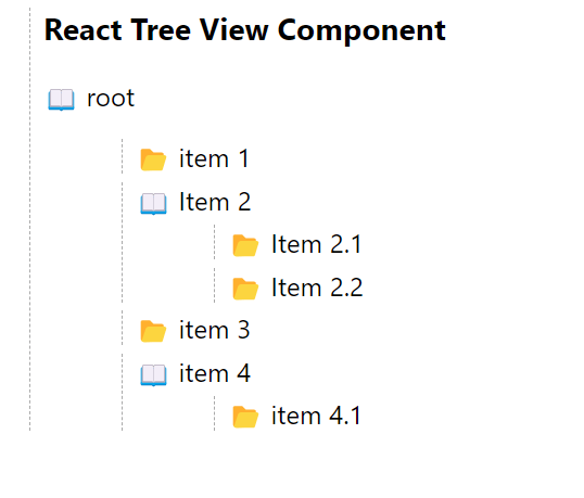
7. Display Tree View in Web Browser
To display the tree view in a web browser, first run the following command in your terminal.
npm start
After that, open the following URL in your web browser to see the calculator
http://localhost:3000/