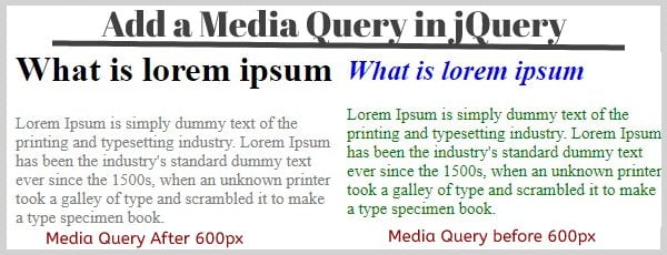
Media Query in JQuery: As you know that Media Query was created in CSS3. It is used to create responsive web pages. Means that it can display the web contents & layouts in different size of devices with proper format. So, It is widely used to create a user-friendly & mobile-friendly website.
In most cases, developers need to add CSS properties & media Query dynamically to the HTML element using jQuery. So, In this tutorial, you will learn it with a simple example.

Steps to add Media Query in jQuery
Suppose that we have a paragraph and title within a div (id=”content”). We have to change the CSS properties of these content in a device that screen size is less than or equal to 600px. This means that Whenever the content page opens in the browser the maximum width is 600px on the device.
Read Also –
How to Add and Remove Input Field Using JavaScript
jQuery Form Validation Before Submit
You will display the content of the above example in different sizes of the device through the following steps.
1. Create an HTML Content
In this step, You have learned to add a media query to the title & description. After learning it, You can easily use a media query to any kind of HTML elements for displaying them on different screen sizes. So, let’s start it with the following steps –
- Create a parent div with id=”content”
- Also, create a title & paragraph with some text within the parent div
- Write some CSS to display the title & description in a proper format
File Name – index.php
<!DOCTYPE html>
<html>
<head>
  <META NAME="ROBOTS" CONTENT="NOINDEX, NOFOLLOW">
<style>
.title{
   color:blue;
   font-style:italic;
   font-size:25px;
}
#content p {
font-size:20px;
color:gray;
}

</style>

</head>
<body>

<div id="content">
<h1>What is lorem ipsum</h1>
<p>Lorem Ipsum is simply dummy text of the printing and typesetting industry. Lorem Ipsum has been the industrys standard dummy text ever since the 1500s, when an unknown printer took a galley of type and scrambled it to make a type specimen book. </p>

</div>

<script src="https://ajax.googleapis.com/ajax/libs/jquery/3.4.1/jquery.min.js"></script>


</body>
</html>
3. Add Media Query Using jQuery
To add a media query to the HTML element, You have to write jquery code with the following steps –
- Create a function
responsive(maxWidth). wheremaxWidthis the parameter - If
maxWidth.matchesis true then a classtitleto the h1 tag and some inline CSS code to the paragraph. otherwise, removetitlefrom the h1 tag & add another inline CSS code. - Pass a value
(max-width: 600px)to the window.matchMedia() and assign it tomaxWidth - Also, Pass
maxWidthto theresponsive(maxWidth) - Apply
addListenerwithresponsiveto themaxWidth
File Name – custom.js
function responsive(maxWidth) {
  if (maxWidth.matches) {
    $('#content h1').addClass('title');
     $('#content p').css({'color':'green','font-size':'15px'});

  } else {
     $('#content h1').removeClass('title');
     $('#content p').css({'color':'grey','font-size':'20px'});
  }
}

 var maxWidth = window.matchMedia("(max-width: 600px)");

 responsive(maxWidth);
 maxWidth.addListener(responsive);
This code only gives you an idea How to add a media query. If you implement this code as it is another HTML element then It will not work. You will have to create a new code for any other kind of element using its concept.
But You should have a good understanding of CSS Media query. If you don’t have then go and learn it first. after that try to implement it in your project.
Don’t forget to include custom.js and jQuery CDN in the index.php. Otherwise, the media query will not work
My Suggestion
Dear Developers, I have that the above script is easy to understand. Now you can easily create a responsive website.
Share the above script with your friends and continue to visit my blog. You will regularly get more new web technology tutorials to develop your coding skills.
