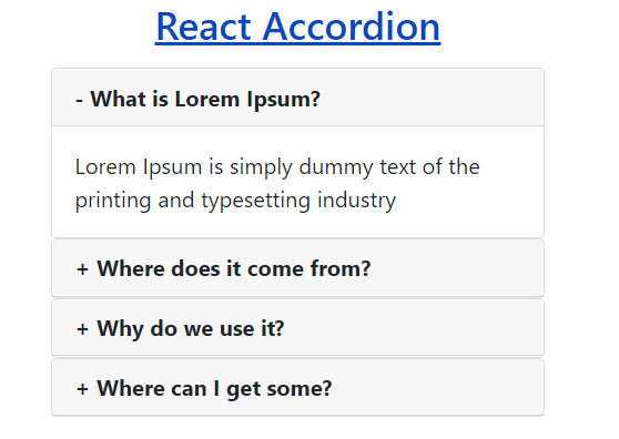
In this tutorial, You will learn How to create a dynamic accordion in React js by implementing some simple steps that are very easy to understand and integrate into projects.
If you need to display important information in the form of multiple lists within a specific area, then you should arrange them in an accordion list. So that users can easily read the given information by clicking on each heading.
In this tutorial, I have created an awesome React accordion with plus and minus icons that is absolutely attractive & user-friendly. When you run your app, you will see only some heading with plus icons in the form of lists. When you click heading one by one then you will see the content & minus icon of that heading respectively.

Dynamic Accordion in React Js
In this tutorial, I have created a dynamic accordion in react js using functional components. Once, you learn it, you can easily create it yourself using the class component.
Learn Also –
Create React Charts in React Js
Create a Simple React Todo App
Portfolio Gallery with Filtering in React Js
Preview Multiple Images before Uploading in React Js
Before getting started, you have to create react app with npm and create the following folders & files within its default folder structure
reactapp/
  |__public/
  |    |__images/
  |__src/
  |   |
  |  accordion/
  |       |__AccordionData.js
  |       |__Accordion.js
  |       |__AccordionList.js
I have used bootstrap 4 to create a responsive weather app. So, You should run the following command
npm install bootstrap
Also, you have to import it into the App.js
import "../node_modules/bootstrap/dist/css/bootstrap.min.css";
For more information, you can learn How to use Bootstrap in React Js
1. Create Accordion Data
First of all, create some data in the form of a JSON array. Here, I have created some questions & answers to display in accordion dynamically. But you can also add more data to this file.
File Name – AccordionData.js
const AccordionData =[
    {
        id:1,
        qn:"What is Lorem Ipsum?",
        ans:"Lorem Ipsum is simply dummy text of the printing and typesetting industry"
    },
    {
        id:2,
        qn:"Where does it come from?",
        ans:"Contrary to popular belief, Lorem Ipsum is not simply random text"

    },
    {
        id:3,
        qn:"Why do we use it?",
        ans:"It is a long established fact that a reader will be distracted by the readable content of a page when looking at its layout"

    },
    {
        id:4,
        qn:"Where can I get some?",
        ans:"There are many variations of passages of Lorem Ipsum available"

    }
]

export default AccordionData;
2. Create an Accordion Component
Accordion Component
import AccordionList from "./AccordionList";
import AccordionData from "./AccordionData";
import { useState } from "react";
function Accordion(){

const [toggle, setToggle] = useState(null);
let handleToggle=(id)=>{
    if(toggle===id){
        setToggle(null);
        return false
    }
   setToggle(id)

}
    return(
        <div className="container">
            <div className="row">
                <div className="col-sm-4">
                <h3>React Accordion</h3>
                <AccordionList accordionData={AccordionData} handleToggle={handleToggle} toggle={toggle} />
                </div>
            </div>
        </div>


    )
}

export default Accordion;
3. Create Accordion List Component
function AccordionList({accordionData, handleToggle, toggle}){

    return(


                accordionData.map((value)=>{
                    const {id, qn, ans} = value;
                    return(
                        <div className="card" key={id}>
                        <div className="card-header" onClick={()=>handleToggle(id)} style={{cursor:"pointer"}}> <b>{(id===toggle)?'-':'+'} {qn}</b></div>
                        {(id===toggle)?<div className="card-body">{ans}</div>:''}

                    </div>

                    )
                })

    )
}

export default AccordionList;
4. Render Accordion Component
To render the Accordion component, You should import it into the App component and return <Accordion />.
File Name – App.js
import "../node_modules/bootstrap/dist/css/bootstrap.min.css";
import Accordion from "./accordion/Accordion";
function App() {
  render(){
  return (
    <Accordion />
  );
  }
}
export default App;
5. Test Accordion Yourself
Now, you can test the React Accordion yourself by running the React App with the following command
npm start
After that, you can see the React Accordion by opening the following URL in your web browser
http://localhost:3000/
